Space Hoisting: Should I use the padding Modifier or the Spacer composable?


Modifiers are one of my favorite features of Jetpack Compose. They allow you to easily add
functionality to your composable functions without having to change the function itself.
This is a huge win for composability and reusability. However, there are some modifiers that are
more commonly used than others. One of these modifiers is the padding Modifier. We use it pretty
much everywhere in our Jetpack Compose based apps to add space to a component.
@Composable
fun MyComponent(
    displayText: String
) {
    Text(
        text = displayText,
        modifier = Modifier.padding(bottom = 16.dp)
    )
}
Additionally, Jetpack Compose also exposes a Spacer composable function. It's part of the compose
foundation package and is used to add space to a component.
@Composable
fun MyComponent(
    displayText: String
) {
    Column {
        Text(displayText)
        Spacer(modifier = Modifier.height(16.dp))
    }
}
Both these examples produce the exact same result and are a valid way of adding space to a component. Surely, this must be a mistake. Why else would Jetpack Compose expose two ways of doing the same thing otherwise 🤔 Well, there are some subtle differences between the two approaches that aren't obvious on the surface. Let's talk about these differences and see how they affect the reusability of your composable function.

The best way to explain this is by looking at a real world use case. I'm using a screen from Robinhood's Android app as an example.

A screen from Robinhood's Android app
Any time you see a screen like this, your first instinct should be to break it down into smaller components. Declarative frameworks like Jetpack Compose naturally force us think of our screen as a collection of reusable components. On doing the same exercise for the screen above, here's a reasonable way to break down this screen.

The entire screen is built using these 7 components
We can essentially create the entire screen using these 7 components. However, there's something really important that we haven't spoken about yet. The screen isn't just a collection of components - the space between the components is just as important as the components themselves. How we treat this space is what makes the difference between a good and a great API.
Note: I'm using the term "space" to refer to the vertical space between the components. For the spacing inside each component, the
paddingmodifier is often the right choice. For the rest of the article, we are going to specifically focus on the space between the components.
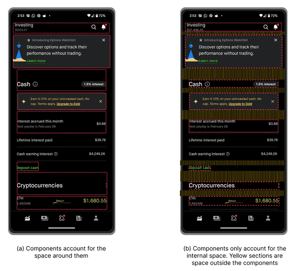
In the screenshot on the left (a), we add the space to the component itself using the padding Modifier.
This certainly works but it's not ideal - if we now wanted to use the SectionHeader component in a
different context, we'd be stuck with the space at the top since its part of the implementation of the
component.


If you've been developing on Android for a while, you might remember that the classic Android UI toolkit
had the concept of margin as a first class citizen. The space that we are adding to some of the components
in screenshot (a) is essentially to emulate the margin from the old world. Margin's break encapsulation
and make it harder to reuse components. Instead, I recommend using
an approach that I like to call Space Hoisting.
"Space" Hoisting
You might remember a term that sounds very similar - state hoisting, that has been extensively covered by Google in their documentation and talks.
State hoisting in Compose is a pattern of moving state to a composable's caller to make a composable stateless
Space hoisting applies the same priciple but to a different concept. We move the responsibility of adding the space between the components to the parent, instead of the component itself. In screenshot (b), the yellow sections are the space that we are adding between the components. This makes the component more reusable in a host of different contexts. Here's the most basic pseudo code for implementing This screen using Space hoisting.
@Composable
fun RobinhoodScreen() {
    LazyColumn {
        NavBar(...)
        Spacer(modifier = Modifier.height(16.dp))
        UpsellCard(...)
        Spacer(...)
        SectionHeader(...)
        Spacer(...)
        OfferCard(...)
        Spacer(...)
        EarningsSection(...)
        Spacer(...)
        ActionRow(...)
        Spacer(...)
        SectionHeader(...)
        Spacer(...)
        TickerRow(...)
    }
}
You will notice that I'm using the Spacer composable for this use case. It's a really common pattern
to add a modifier parameter to our composable functions. Even if we were to move the responsibility
of adding the space to the parent, we could've very easily passed in a modifier that added the padding
to the component, something along the lines of NavBar(modifier = Modifier.padding(16.dp)). So why
use the Spacer composable instead? Well, there are a few reasons for that.
Using
Spaceris a more intentional way of adding space. It's a lot more obvious and allows your components to remain encapsuated and not be impacted by the context in which they are being used in.A lot of components react to gestures and animations. Imagine a row component that shows the ripple effect when you tap on it. If we were to pass in the
paddingModifier to that component, even this extra space that we added would react to the gesture. As the order of theModifiersmatter, you might be able to avoid this problem, but it would depend on the implementation. UsingSpacersimplifies this and avoids the problem altogether.
The extra space added to the component also reacts to the touch gesture, which is not ideal
- Often, components have logic that is dependent on the size of the component. If we
were to alter the dimensions of the component by adding extra space to it, we'd end up with
incorrect behavior. We also avoid this problem by using the
Spacercomposable.
Summary
In this blog post, we explored the usage of padding Modifier and Spacer composable function in
Jetpack Compose. While both functions serve the same purpose of adding space to a component, there
are some subtle differences between the two that affect the reusability of the composable functions.
We also looked at a real-world example to explain how these differences impact the overall design of
a screen. Finally, we looked at a technique that I call "Space Hoisting", where the responsibility of
adding space is moved to the parent instead of the component itself.
I hope you learnt something new today. Please consider sharing this article within your networks. Until next time 👋

