bonsai
:deciduous_tree: A multiplatform tree view for Jetpack Compose
View on GitHubDocumentation


Bonsai
A batteries-included Tree View for Jetpack Compose


Features
- Multiplatform: Android, Desktop
- State-aware: changes in the tree will trigger recomposition
- Unlimited depth
- Lazy loaded nodes
- Survives activity recreation
- Built-in DSL
- File System integration
- JSON integration
- Expandable
- Selectable
- Clickable
- Styleable
- Extendable
Roadmap
- iOS support
- Draggable nodes
- FileObserver (Android) and/or WatchService (JVM) integration
Import to your project
Add the desired dependencies to your module's build.gradle:
implementation "cafe.adriel.bonsai:bonsai-core:${latest-version}"
implementation "cafe.adriel.bonsai:bonsai-file-system:${latest-version}"
implementation "cafe.adriel.bonsai:bonsai-json:${latest-version}"
Current version:

Usage
Bonsai comes with a handy DSL for creating high-performance, customizable trees:
- Start by creating a new tree with
Tree<T>{} - Create nodes with
Leaf<T>()andBranch<T>() - Call
Bonsai()to render the tree
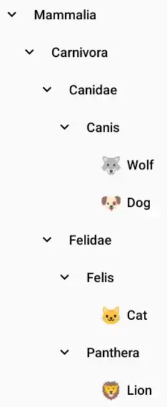
@Composable
fun BonsaiExample() {
    val tree = Tree {
        Branch("Mammalia") {
            Branch("Carnivora") {
                Branch("Canidae") {
                    Branch("Canis") {
                        Leaf("Wolf", customIcon = { EmojiIcon("🐺") })
                        Leaf("Dog", customIcon = { EmojiIcon("🐶") })
                    }
                }
                Branch("Felidae") {
                    Branch("Felis") {
                        Leaf("Cat", customIcon = { EmojiIcon("🐱") })
                    }
                    Branch("Panthera") {
                        Leaf("Lion", customIcon = { EmojiIcon("🦁") })
                    }
                }
            }
        }
    }

    Bonsai(tree)
}
Output:


Take a look at the sample app for working examples.
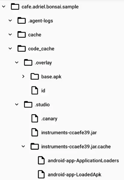
File System integration
Import cafe.adriel.bonsai:bonsai-file-system module to use it.
val tree = FileSystemTree(
    // Also works with java.nio.file.Path and okio.Path
    rootPath = File(path),
    // To show or not the root directory in the tree
    selfInclude = true
)

Bonsai(
    tree = tree,
    // Custom style
    style = FileSystemBonsaiStyle()
)
Output:


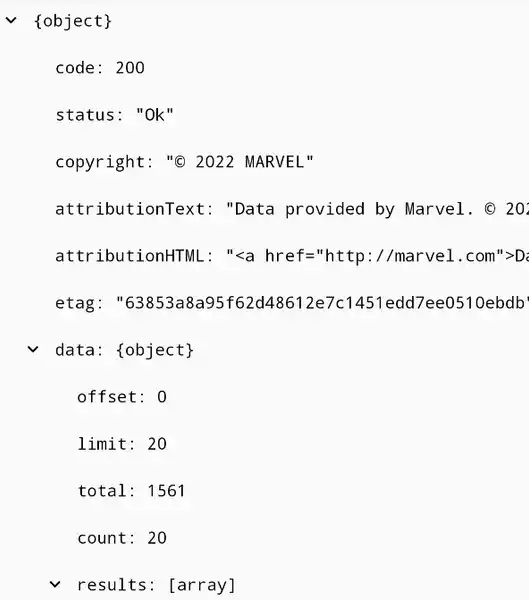
JSON integration
Import cafe.adriel.bonsai:bonsai-json module to use it.
val tree = JsonTree(
    // Sample JSON from https://gateway.marvel.com/v1/public/characters
    json = responseJson
)

Bonsai(
    tree = tree,
    // Custom style
    style = JsonBonsaiStyle()
)
Output:


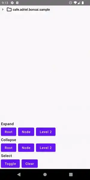
Expanding & Collapsing
Easily control the expanded/collapsed state of your Tree:
toggleExpansion(node)collapseRoot()/expandRoot()collapseAll()/expandAll()collapseFrom(depth)/expandUntil(depth)collapseNode(node)/expandNode(node)
Selecting
Selected/Unselected state is also pretty simple to control:
selectedNodestoggleSelection(node)selectNode(node)/unselectNode(node)clearSelection()
Click handling
Its also possible to set custom click behaviors for your Tree. Control single, double and long clicks by using the expand and select APIs.
Bonsai(
    tree = tree,
    onClick = { node ->
        tree.clearSelection()
        tree.toggleExpansion(node)
    },
    onDoubleClick = { node -> /* ... */ },
    onLongClick = { node -> /* ... */ }
)
Styling
Change your Tree appearance as you wish. Take a look at BonsaiStyle class for all available customizations.
Bonsai(
    tree = tree,
    style = BonsaiStyle(
        toggleIconRotationDegrees = 0f,
        toggleIcon = { node ->
            rememberVectorPainter(
                if (node is BranchNode && node.isExpanded) Icons.Outlined.UnfoldLess
                else Icons.Outlined.UnfoldMore
            )
        },
        nodeIconSize = 18.dp,
        nodeShape = CutCornerShape(percent = 20),
        nodeCollapsedIcon = { rememberVectorPainter(Icons.Outlined.Circle) },
        nodeExpandedIcon = { rememberVectorPainter(Icons.Outlined.Adjust) },
        nodeNameTextStyle = MaterialTheme.typography.overline
    )
)
Output:

Custom nodes
Need a deeper customization? You can set customIcons and customNames for each Leaf<T>() and Branch<T>() nodes.
Leaf(
    content = "Wolf",
    customIcon = { EmojiIcon("🐺") }
)
Output:

Similar Libraries
Compose Color Picker
Jetpack Compose Android Color Picker 🎨
Collapsible App Bar
Collapsible App bar made with Jetpack Compose & Motion Compose
Dropdown
💧 A Powerful and customizable Jetpack Compose dropdown menu with cascade and animations
Segmented Progress Bar
Beautiful progress bar with segments. Highly customizable. Fully written with Jetpack Compose
Browse by Category


