Compose Stacked Snackbar
Stacked Snackbar for Compose Multiplatform (Android, iOS and Desktop)
View on GitHubDocumentation
Compose Stacked Snackbar 🗂️
Stacked Snackbar for Compose Multiplatform (Android, iOS and Desktop). This library has built-in basic snackbar type (error, warning, success and info) and also able to accept custom composable snackbar


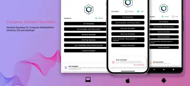


Interaction and Animation
Compose Stacked Snackbar support swipe left or right interaction to dismiss the snackbar
| Interaction | Animation Type : Bounce | Animation Type : Slide |
|---|---|---|
Features
- Built-in basic snackbar type for error, warning, info and success
- Support custom composable snackbar
- Swipe left or right to dismiss
- Built-in bounce and slide animation
- Support custom snackbar action
- Auto dismiss with duration (short and long duration)
- Support max stack configuration
- Easy to use and easy to migrate from default compose snackbar
Usage Comparison with Default Compose Snackbar
| Deafult Compose Snackbar | Compose Stacked Snackbar |
|---|---|
There is no need to add/manage coroutine scopes to launch compose stacked snackbar, because compose stacked snackbar already has internal coroutine scopes.
Installation
Compose Multiplatform
Add this line to shared build.gradle
sourceSets {
  commonMain.dependencies {
    implementation("io.github.rizmaulana:compose-stacked-snackbar:1.0.3")
  }
}
If your android version targetSdk and compileSdk <= 33, you need to add this line on project level build.gradle
subprojects {
    project.configurations.configureEach {
        resolutionStrategy {
            force("androidx.emoji2:emoji2-views-helper:1.3.0")
            force("androidx.emoji2:emoji2:1.3.0")
        }
    }
}
Android
Add this line to app level build.gradle
dependencies {
  implementation "io.github.rizmaulana:compose-stacked-snackbar:1.0.3"
}

// If your android version `targetSdk` and `compileSdk` <= 33, you need to add this line
project.configurations.configureEach {
    resolutionStrategy {
        force("androidx.emoji2:emoji2-views-helper:1.3.0")
        force("androidx.emoji2:emoji2:1.3.0")
    }
}
Usage
Basic Usage
val stackedSnackbarHostState = rememberStackedSnackbarHostState()

Scaffolf(
  snackbarHost = { StackedSnackbarHost(hostState = stackedSnackbarHostState)  }
){
  Button(onClick = {
    stackedSnackbarHostState.showInfoSnackbar("Info Snackbar")
  }){
    Text("Click Me!")
  }
}
Snackbar Configuration
val stackedSnackbarHostState = rememberStackedSnackbarHostState(
  maxStack = 5,
  animation = StackedSnackbarAnimation.Slide
)
Snackbar Type
stackedSnackbarHostState.showInfoSnackbar("Info Snackbar")

stackedSnackbarHostState.showWarningSnackbar("Warning Snackbar")

stackedSnackbarHostState.showErrorSnackbar("Error Snackbar")

stackedSnackbarHostState.showSuccessSnackbar("Success Snackbar")

stackedSnackbarHostState.showCustomSnackbar(content = { dismiss ->
  Row {
    Text("Custom Snackbar")
    Image(painterResource = "close.xml", modifier = Modifier.clickable { dismiss.invoke() })
  }
})
Built-In Snackbar Parameter
stackedSnackbarHostState.showInfoSnackbar(
  title = "Info Snackbar",
  description = "Description of Info Snackbar",
  actionLabel = "Go To Settings",
  action = {
    println("Action snackbar clicked")
  },
  duration = StackedSnackbarDuration.Short
)
Note : Auto dismiss duration (StackedSnackbarDuration.Short and StackedSnackbarDuration.Long) only works if there is only 1 stacked snackbar, if there are more than 1 stacked snackbar, auto dismiss duration will be disable.
Contributing
Pull requests are welcome
Credits
- Snackbar Inspiration by Emil Kowalski
- Compose Multiplatform Library Template by KevinnZou
Related Questions
Similar Libraries
Compose Color Picker
Jetpack Compose Android Color Picker 🎨
Collapsible App Bar
Collapsible App bar made with Jetpack Compose & Motion Compose
Dropdown
💧 A Powerful and customizable Jetpack Compose dropdown menu with cascade and animations
Segmented Progress Bar
Beautiful progress bar with segments. Highly customizable. Fully written with Jetpack Compose
Browse by Category


