Kompose Country Code Picker
A Jetpack Compose library based on Material 3 that provides a country code picker for Android apps.
View on GitHubDocumentation

Kompose Country Code Picker
A Compose Multiplatform country code picker built with Material 3.
Supported platforms: Android · iOS · Desktop (JVM) · Web (JS) · Web (WasmJS)
See the project's website for full documentation.
Features
- 250+ countries with flags, dialling codes, and localized names
- Built-in phone number validation and formatting
- Search with accent-normalized matching
- Responsive dialog - full-screen on mobile, popup on desktop/web
- Custom text field support - use
CountrySelectionDialog+state.selectedCountryfor fully custom layouts - 13 language translations
- Customizable colors, shapes, and icons
- Keyboard navigation support (Arrow keys, Enter, Escape) on desktop and web
Installation
Add the Maven Central repository if it is not already there:
repositories {
    mavenCentral()
}
Multiplatform Projects
Add the dependency to your commonMain source set:
kotlin {
    sourceSets {
        commonMain {
            dependencies {
                implementation("io.github.joelkanyi:komposecountrycodepicker:<latest-version>")
            }
        }
    }
}
Android Projects
Add the dependency to your app's build.gradle.kts:
dependencies {
    implementation("io.github.joelkanyi:komposecountrycodepicker:<latest-version>")
}
Gradle Version Catalog
Add the following to your libs.versions.toml:
[versions]
komposecountrycodepicker = "<latest-version>"

[libraries]
komposecountrycodepicker = { module = "io.github.joelkanyi:komposecountrycodepicker", version.ref = "komposecountrycodepicker" }
Then add the dependency in your build.gradle.kts:
dependencies {
    implementation(libs.komposecountrycodepicker)
}
Quick Start
Use the picker in your Composable:
var phoneNumber by rememberSaveable { mutableStateOf("") }
val state = rememberKomposeCountryCodePickerState(
    showCountryCode = true,
    showCountryFlag = true,
)

KomposeCountryCodePicker(
    modifier = Modifier.fillMaxWidth(),
    text = phoneNumber,
    onValueChange = { phoneNumber = it },
    state = state,
)
Fully Custom Text Field
If you have your own design system and want to use your own text field, use CountrySelectionDialog and state.selectedCountry directly:
@OptIn(RestrictedApi::class)
@Composable
fun PhoneNumberField() {
    var phoneNumber by rememberSaveable { mutableStateOf("") }
    var showCountryPicker by rememberSaveable { mutableStateOf(false) }
    val state = rememberKomposeCountryCodePickerState()

    if (showCountryPicker) {
        CountrySelectionDialog(
            countryList = state.countryList,
            containerColor = MaterialTheme.colorScheme.background,
            contentColor = MaterialTheme.colorScheme.onBackground,
            onDismissRequest = { showCountryPicker = false },
            onSelect = { country ->
                state.setCode(country.code)
                showCountryPicker = false
            },
        )
    }

    OutlinedTextField(
        modifier = Modifier.fillMaxWidth(),
        value = phoneNumber,
        onValueChange = { phoneNumber = it },
        placeholder = { Text("Phone Number") },
        keyboardOptions = KeyboardOptions(keyboardType = KeyboardType.Phone),
        leadingIcon = {
            Row(
                modifier = Modifier
                    .clickable { showCountryPicker = true }
                    .padding(start = 12.dp, end = 8.dp),
                verticalAlignment = Alignment.CenterVertically,
            ) {
                Image(
                    modifier = Modifier.width(28.dp).height(18.dp),
                    painter = painterResource(state.selectedCountry.flag),
                    contentDescription = state.selectedCountry.name,
                )
                Spacer(modifier = Modifier.width(6.dp))
                Text(text = state.selectedCountry.phoneNoCode)
            }
        },
    )
}
See the full documentation for more details and a BasicTextField variant.
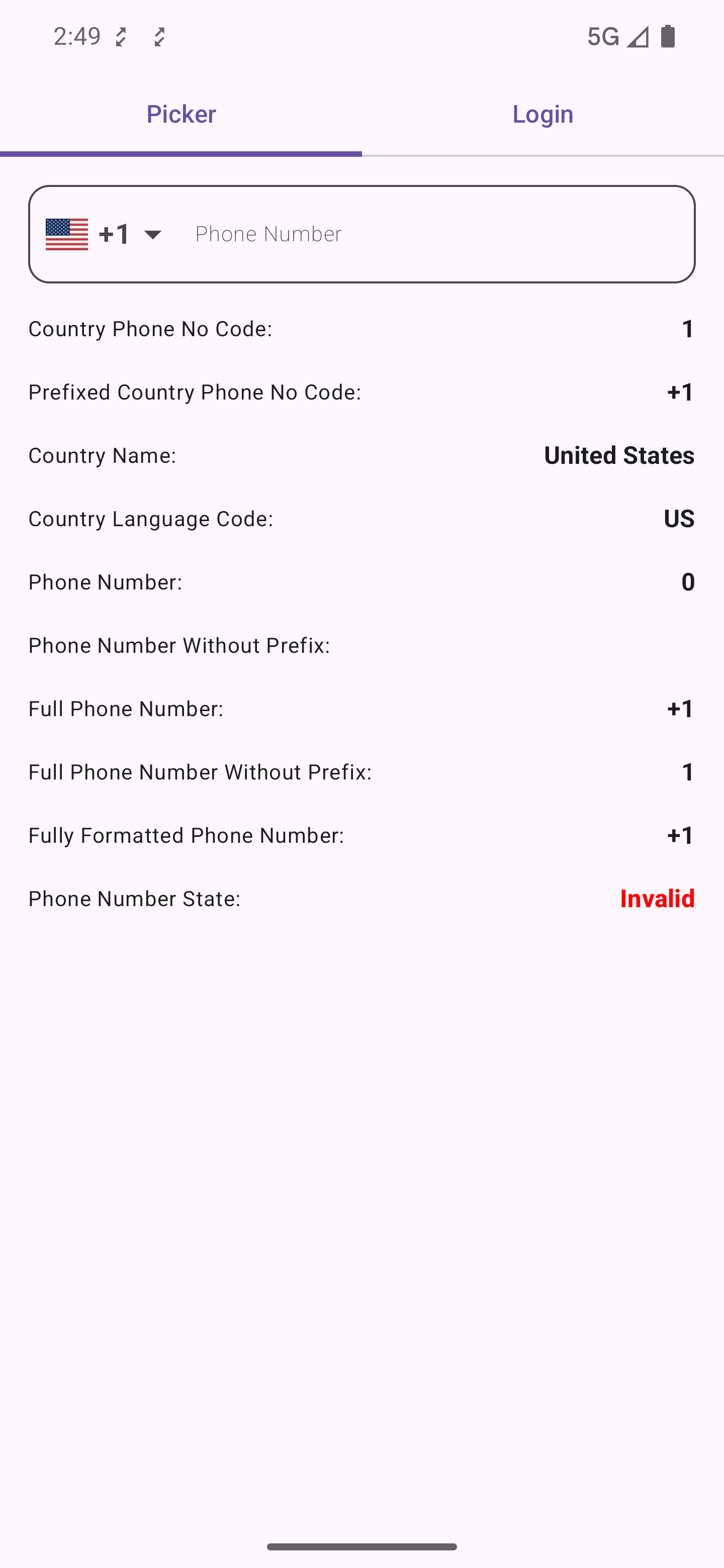
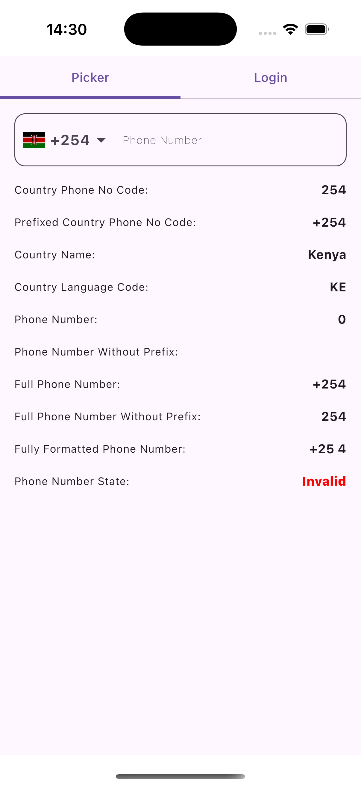
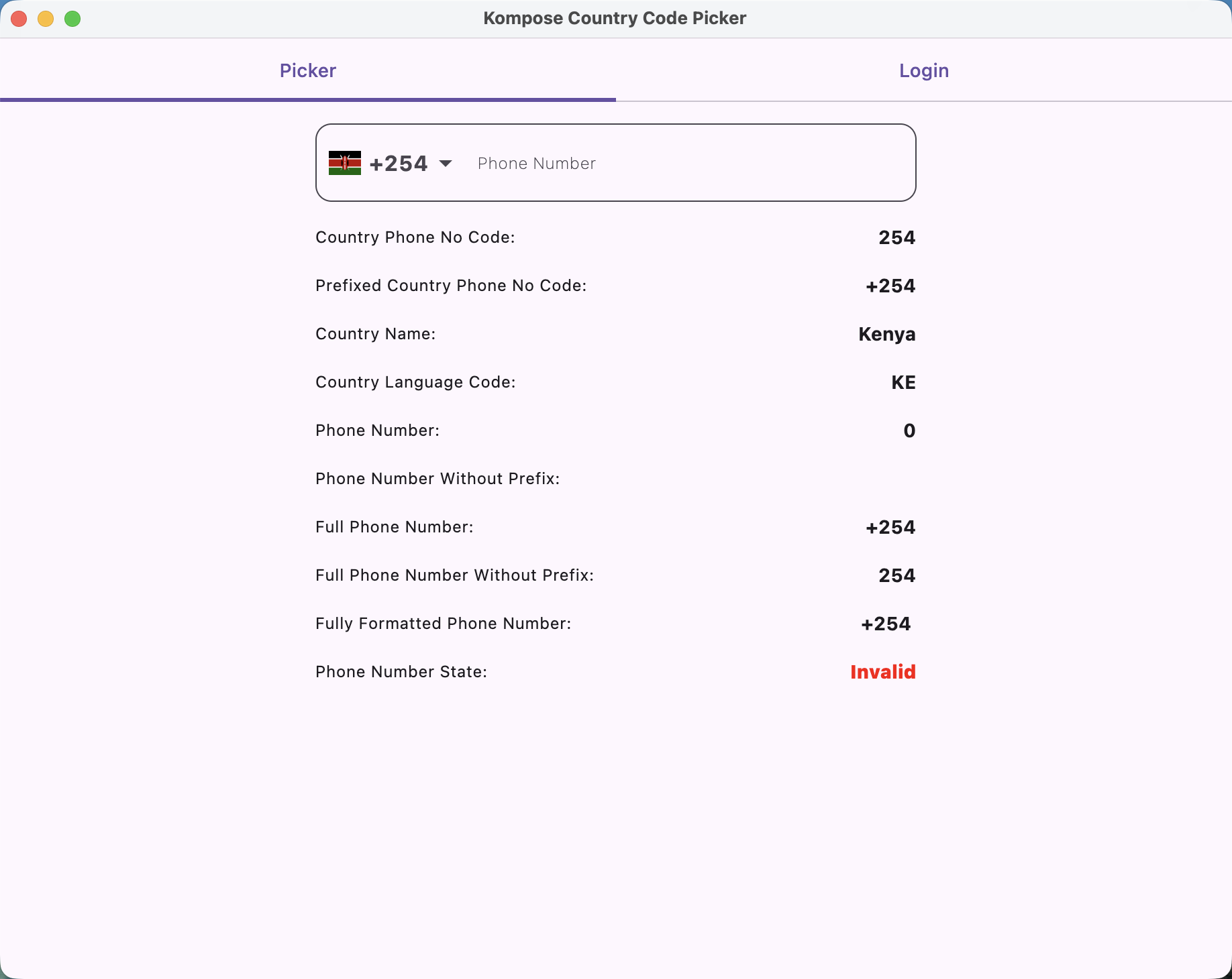
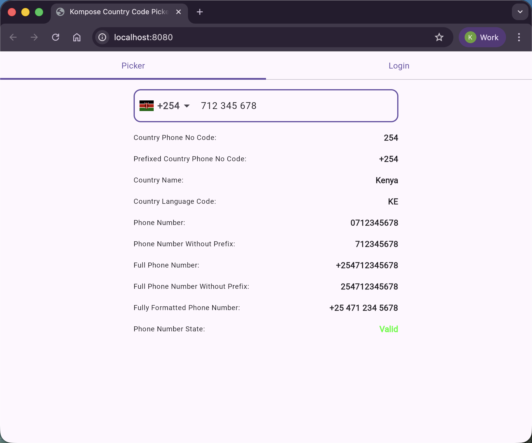
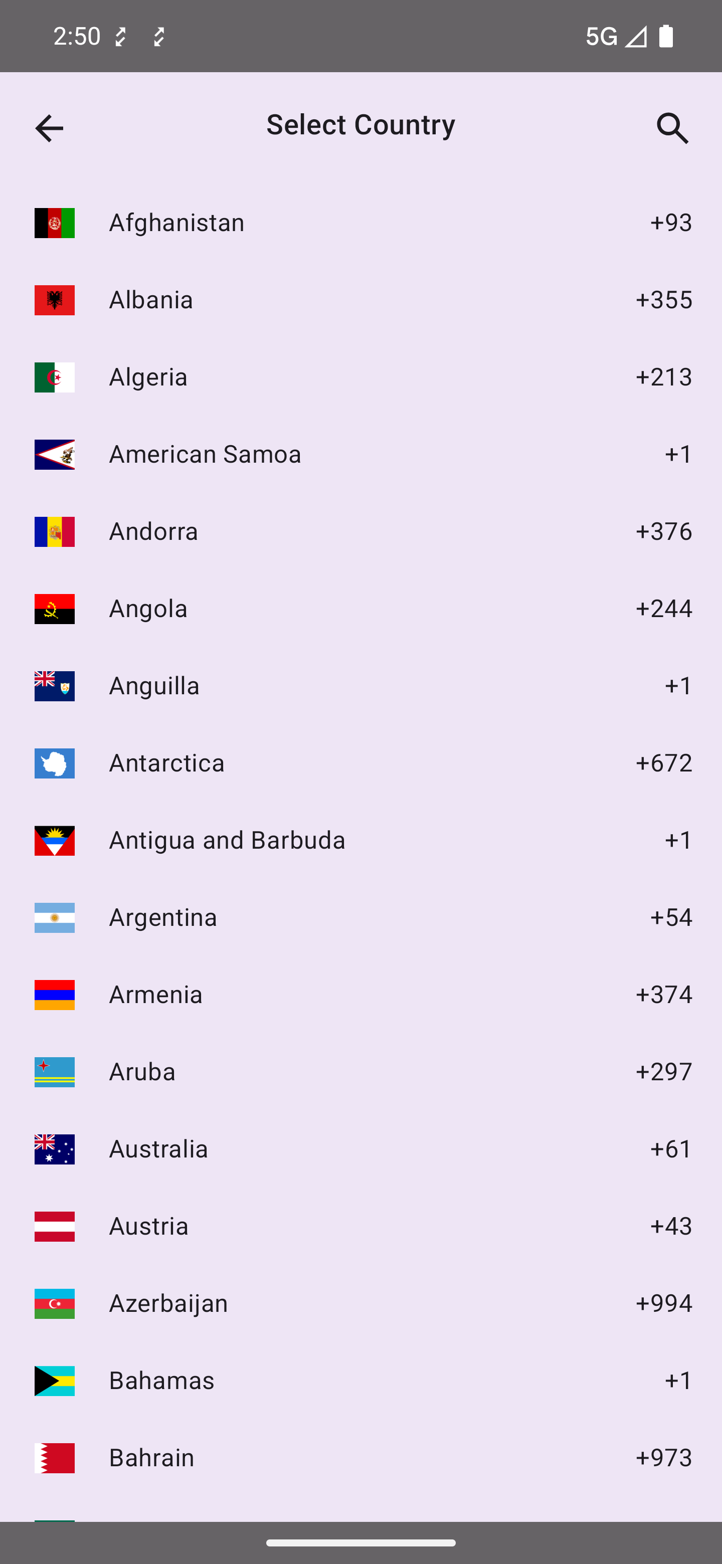
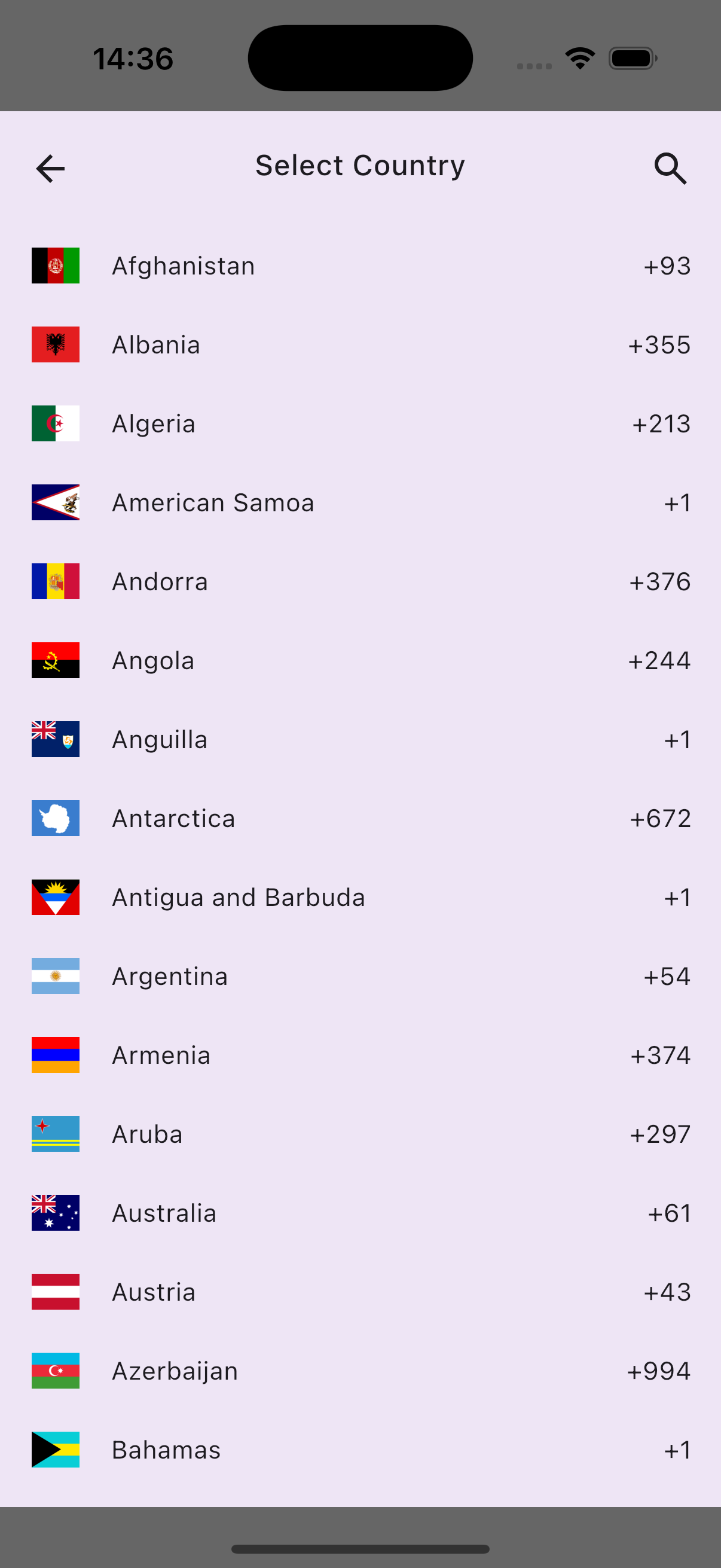
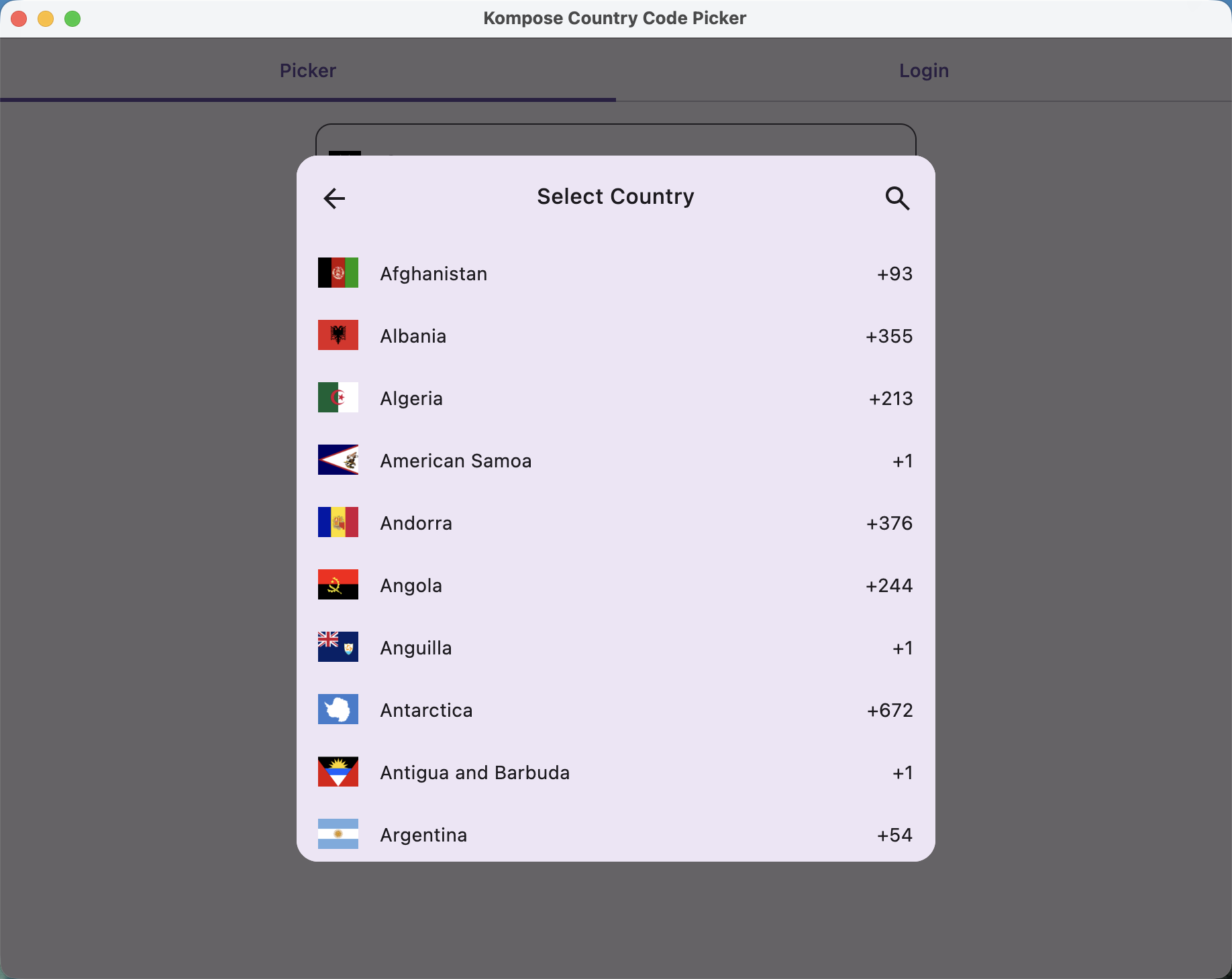
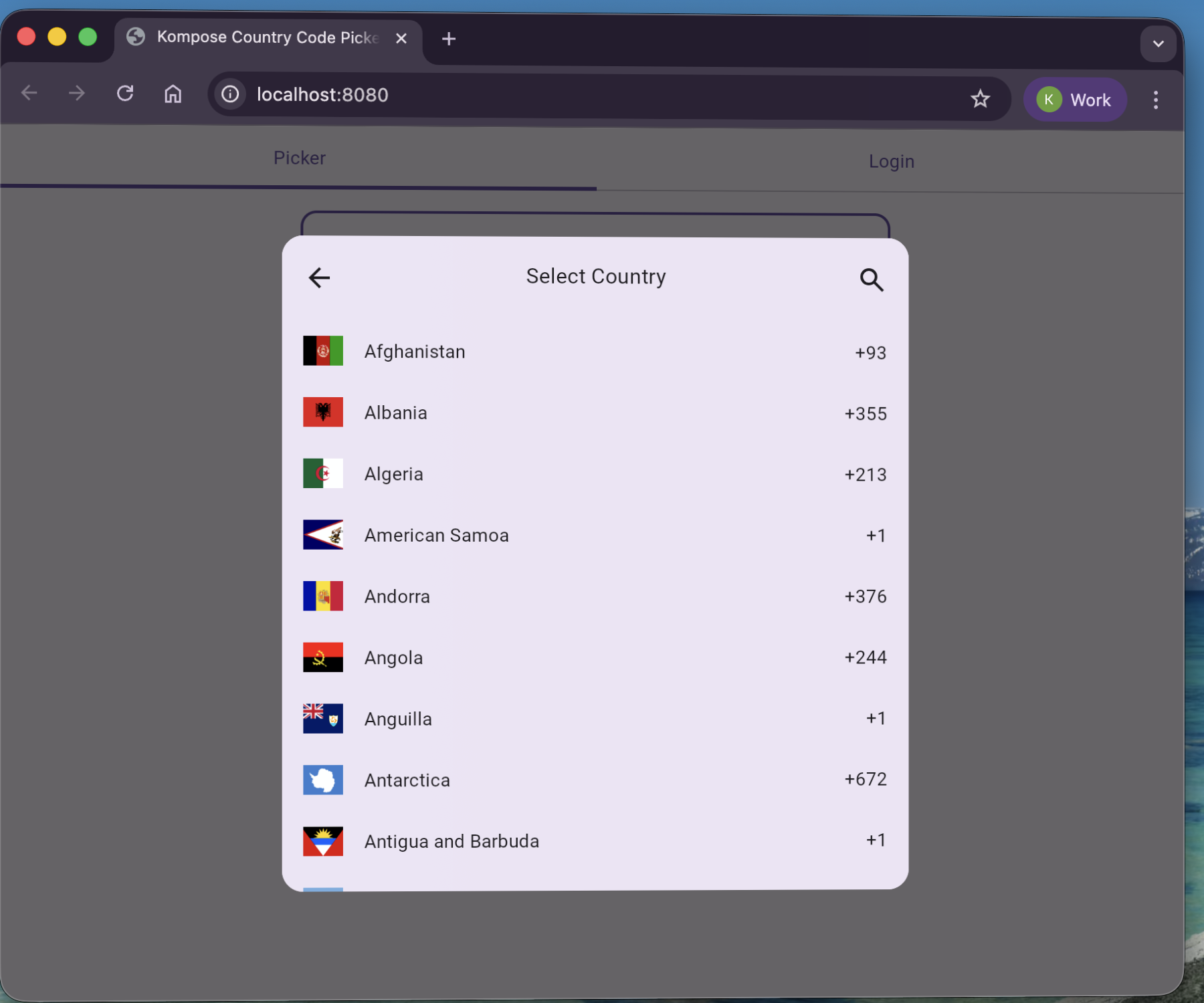
Preview
| Android | iOS | Desktop | Web |
|---|---|---|---|
 |
 |
 |
 |
 |
 |
 |
 |
Translations
This project includes translations for the following languages:
- Arabic (ar)
- German (de)
- Spanish (es)
- French (fr)
- Hindi (hi)
- Indonesian (in-rID)
- Italian (it-IT)
- Japanese (ja)
- Marathi (mr)
- Dutch (nl)
- Russian (ru-RU)
- Swahili (sw)
- Tamil (ta)
- Turkish (tr-TR)
- Vietnamese (vi)
If your language is not included, or if you notice any errors in the current translations, please open an issue on GitHub.
License
Copyright 2025 Joel Kanyi

Licensed under the Apache License, Version 2.0 (the "License");
you may not use this file except in compliance with the License.
You may obtain a copy of the License at

   http://www.apache.org/licenses/LICENSE-2.0

Unless required by applicable law or agreed to in writing, software
distributed under the License is distributed on an "AS IS" BASIS,
WITHOUT WARRANTIES OR CONDITIONS OF ANY KIND, either express or implied.
See the License for the specific language governing permissions and
limitations under the License.
Similar Libraries
Compose Color Picker
Jetpack Compose Android Color Picker 🎨
Collapsible App Bar
Collapsible App bar made with Jetpack Compose & Motion Compose
Heart Switch
❤️ A heart-shaped toggle switch component for Jetpack Compose
Dropdown
💧 A Powerful and customizable Jetpack Compose dropdown menu with cascade and animations
Browse by Category


