Documentation
🌈 Palette
A color picker library made in Jetpack Compose.


Including in your project

Gradle
Add it in your root build.gradle at the end of repositories:
allprojects {
    repositories {
	maven { url 'https://jitpack.io' }
	}
    }
Add the dependency.
dependencies {
 implementation 'com.github.Shivamdhuria:palette:Tag'
	}
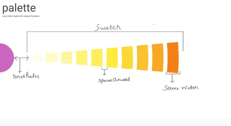
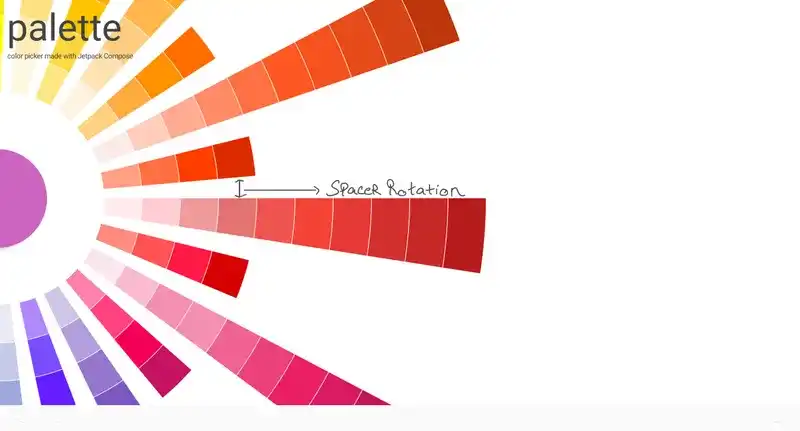
Terminology


How to use
Palette(
       defaultColor = Color.Magenta,
       buttonSize = 210.dp,
       swatches = Presets.material(),
       innerRadius = 400f,
       strokeWidth = 120f,
       spacerRotation = 5f,
       spacerOutward = 2f,
       verticalAlignment = Middle,
       horizontalAlignment = Start,
       onColorSelected = { onColorSelected(it) }
     )
How to change positioning of Color Picker?
The color picker can be positioned by using the combinations of vertical and horizontal alignments. For verticalAlignment, use Top,Middle,Bottom and for horizontalAlignment, use Start,Center,End. For example to position the color picker on top left, use -
Palette(
        buttonSize = 210.dp,
        swatches = Presets.material(),
        verticalAlignment = VerticalAlignment.Top,
        horizontalAlignment = HorizontalAlignment.Start,
         )
Which would make the color picker look like this.

How to set button properties?
Palette(
        defaultColor = Color.Blue,
        buttonSize = 210.dp,
        selectedArchAnimationDuration = 1000,
        ...
        )
The library uses a FAB button under the hood whose defaultColor , buttonSize and selectedArchAnimationDuration can be set. selectedArchAnimationDuration is the duration of the color change animation of the button when a color is picked.
How to change colors in the Palette?
Palette(
       swatches = Presets.material(),
        )
swatches parameter accepts a list of Swatches. Each Swatch contains a list of colors. Ideally swatches must only shades of the same color but sometime you need to go a little crazy.
How to know when a color is picked?
Palette(
      onColorSelected = { onColorSelected(it) },
      swatches = Presets.material(),
        )
onColorSelected parameter accepts a function which is triggered when a color is picked. It also return the value of the Color which is picked.
Code & Issues
If you are a developer and you wish to contribute to the app please raise an issue, discuss, fork and submit a pull request.
Follow Github Flow for collaboration!
Find this repository useful? :heart:
Support it by joining starring this repository. :star:
And follow me on Medium, Github and Twitter
Project Maintainers
This project is founded and actively maintained by Shivam Dhuria.
License
Copyright 2021 Shivam Dhuria

Licensed under the Apache License, Version 2.0 (the "License");
you may not use this file except in compliance with the License.
You may obtain a copy of the License at

   http://www.apache.org/licenses/LICENSE-2.0

Unless required by applicable law or agreed to in writing, software
distributed under the License is distributed on an "AS IS" BASIS,
WITHOUT WARRANTIES OR CONDITIONS OF ANY KIND, either express or implied.
See the License for the specific language governing permissions and
limitations under the License.
Similar Libraries
Compose Color Picker
Jetpack Compose Android Color Picker 🎨
Collapsible App Bar
Collapsible App bar made with Jetpack Compose & Motion Compose
Dropdown
💧 A Powerful and customizable Jetpack Compose dropdown menu with cascade and animations
Segmented Progress Bar
Beautiful progress bar with segments. Highly customizable. Fully written with Jetpack Compose
Browse by Category


