Showcase Layout Compose
Showcase Layout allows you to easily showcase and explain jetpack compose UI elements to users in a beautiful and attractive way.
View on GitHubDocumentation


Showcase Layout Compose
Create beautiful animated showcase effects for your compose UIs easily!
Now with multiplatform support and two different showcase layouts to choose from:
- ShowcaseLayout: Classic full-screen overlay with cutouts
- TargetShowcaseLayout: Modern targeted highlighting with customizable shapes
Web demo
Click here to try showcase layout for web in your browser!
Demo
| ShowcaseLayout |
|---|
 |


https://github.com/user-attachments/assets/faa5dc19-606a-4731-80b1-44cbf6d08fdc


Setup
Showcase Layout Compose can be used in both Jetpack Compose (native Android) or Compose Multiplatform (Kotlin Multiplatform) projects.
Compose multiplatform support starts at version
1.0.5-alpha-8and up.
Add the dependency to your module's build.gradle file like below
implementation("ly.com.tahaben:showcase-layout-compose:1.0.9")
Usage
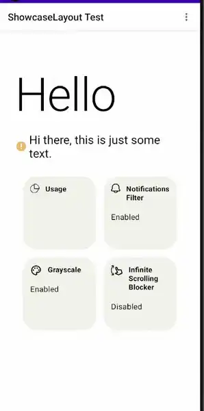
Step 1
Create a ShowcaseLayout and make it the root composable (put all screen composables inside it)
    var isShowcasing by remember {
    mutableStateOf(true)
}
ShowcaseLayout(
    isShowcasing = isShowcasing,
    onFinish = { isShowcasing = false }
) {
    // screen content here
    Column(
        modifier = Modifier
            .fillMaxSize()
    ) {
        Text(text = "ShowcaseLayout Test 1")
        Spacer(modifier = Modifier.height(16.dp))
        Text(text = "ShowcaseLayout Test 2")
        Spacer(modifier = Modifier.height(16.dp))
        Text(text = "ShowcaseLayout Test 3")
    }
}
Step 2
In composables you want to showcase on the modifier use Modifier.showcase(), Lets say we want to
showcase the first
text "ShowcaseLayout Test 1"
Text(
    modifier = Modifier.showcase(
        // should start with 1 and increment with 1 for each time you use Modifier.showcase()
        index = 1,
        message = ShowcaseMsg(
            "This is a showcase message",
            textStyle = TextStyle(color = Color.White)
        )
    ),
    text = "ShowcaseLayout Test 1"
)
you also use the old method by wrap the composables you want to showcase with Showcase()
Step 3
You have 2 ways of showcasing, showcase everything subsequently or showcasing each item manually
Showcase all items subsequently
Start showcasing by makingisShowcasing = true, and stop showcasing by making it false
above we stop showcasing after we showcase the last item using `onFinished` which is called whenever
all items are showcased,
Showcase a single item (1.0.5 and up)
After you attach the index and showcase message to your components you can simply callshowcaseItem(i) where i is the index of the item you want to showcase
    val coroutineScope = rememberCoroutineScope()

    coroutineScope.launch{
        showcaseItem(1)
    }
similarly you can show a greeting using showGreeting and passing the message
    val coroutineScope = rememberCoroutineScope()

    coroutineScope.launch{
        showGreeting(
            ShowcaseMsg(
            text = "I like compose bro <3",
            textStyle = TextStyle(color = Color.White)
            )
        )
    }
Done, our text is now showcased!, customize it further with Additional parameters.
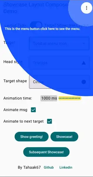
TargetShowcaseLayout (New!)
Starting from version 1.0.6, Showcase Layout Compose now offers a new layout option: TargetShowcaseLayout. This layout provides a different visual approach to showcasing UI elements by highlighting specific targets with customizable shapes rather than the full-screen approach of the original ShowcaseLayout.
Key Features
- Highlights target elements with customizable shapes (circle, rectangle, or rounded rectangle)
- Smooth animations between targets
- Pulsing effect around the target for better visibility
- All the same customization options as the original ShowcaseLayout
Usage
You can use TargetShowcaseLayout directly:
var isShowcasing by remember { mutableStateOf(true) }

TargetShowcaseLayout(
    isShowcasing = isShowcasing,
    onFinish = { isShowcasing = false },
    targetShape = TargetShape.ROUNDED_RECTANGLE, // CIRCLE, RECTANGLE, or ROUNDED_RECTANGLE
    cornerRadius = 8.dp, // Only used with ROUNDED_RECTANGLE
    animateToNextTarget = true, // Smooth animation between targets
    greeting = ShowcaseMsg(
        "Welcome to TargetShowcaseLayout!",
        textStyle = TextStyle(color = Color.White)
    )
) {
    // Your UI content here
    Column {
        Text(
            modifier = Modifier.showcase(
                index = 1,
                message = ShowcaseMsg(
                    "This element is highlighted with TargetShowcaseLayout",
                    textStyle = TextStyle(color = Color.White)
                )
            ),
            text = "Target Showcase Example"
        )
    }
}
| TargetShowcaseLayout with CIRCLE shape | TargetShowcaseLayout with RECTANGLE shape | TargetShowcaseLayout with ROUNDED_RECTANGLE shape |
|---|---|---|
 |
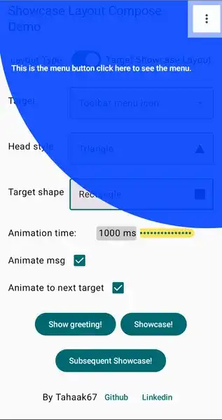 |
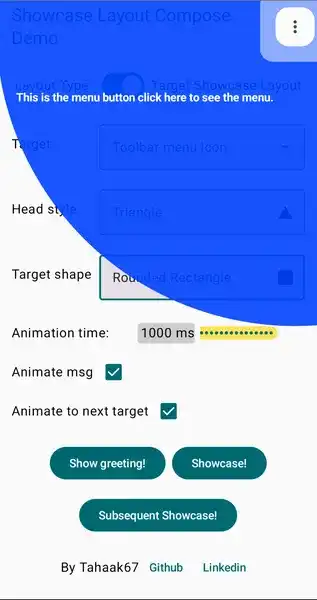 |


TargetShowcaseLayout vs ShowcaseLayout
| Feature | TargetShowcaseLayout | ShowcaseLayout |
|---|---|---|
| Visual style | Highlights specific targets with shapes | Full-screen overlay with cutouts |
| Target shapes | Circle, Rectangle, Rounded Rectangle | Circle, Rectangle, Rounded Rectangle |
| Animations | Smooth transitions between targets | Fade transitions |
| Pulsing effect | Yes | No |
| Use cases | Focused UI tours, precise element highlighting | General app tours, feature introductions |
TargetShowcaseLayout Parameters
In addition to the parameters shared with ShowcaseLayout, TargetShowcaseLayout offers:
TargetShowcaseLayout(
    // Common parameters (same as ShowcaseLayout)
    isShowcasing = isShowcasing,
    isDarkLayout = false,
    initIndex = 0,
    animationDuration = 1000,
    onFinish = { isShowcasing = false },
    greeting = ShowcaseMsg(
        "Welcome to TargetShowcaseLayout!",
        textStyle = TextStyle(color = Color.White)
    ),
    lineThickness = 5.dp,

    // TargetShowcaseLayout specific parameters
    targetShape = TargetShape.CIRCLE, // CIRCLE, RECTANGLE, or ROUNDED_RECTANGLE
    cornerRadius = 8.dp, // Only used with ROUNDED_RECTANGLE
    animateToNextTarget = true // Smooth animation between targets, otherwise shrink and expand on each target
) {
    // Your UI content here
}
Additional parameters
isDarkLayout
Makes the showcase view white instead of black (useful for dark UI).
ShowcaseLayout(
    isShowcasing = isShowcasing,
    onFinish = { isShowcasing = false },
    isDarkLayout = isSystemInDarkTheme()
)
isDarkLayout = true
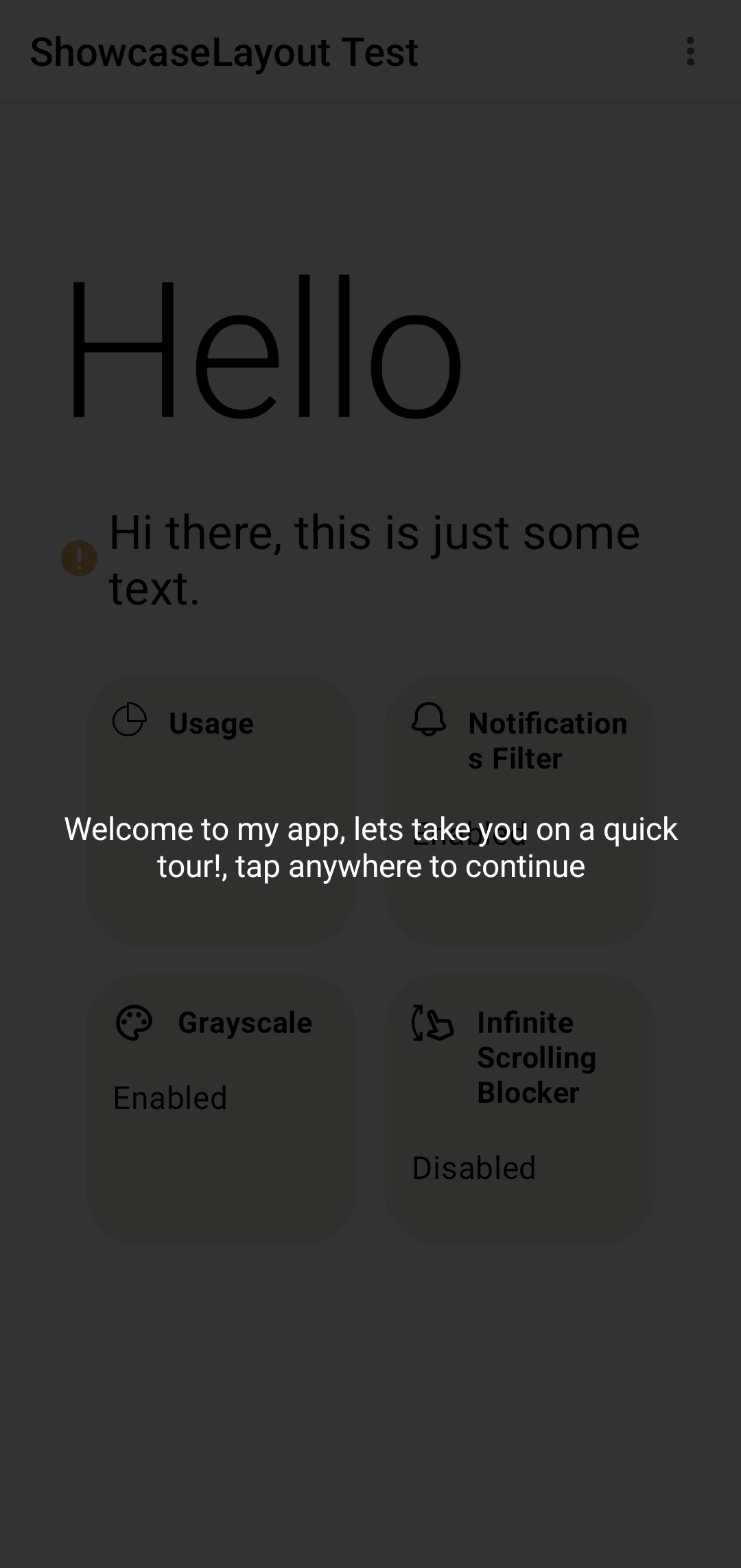
greeting
A customizable greeting message of type showcaseMsg()
ShowcaseLayout(
    isShowcasing = isShowcasing,
    onFinish = { isShowcasing = false },
    isDarkLayout = isSystemInDarkTheme(),
    greeting = ShowcaseMsg(
        "Welcome to my app, lets take you on a quick tour!, tap anywhere to continue",
        textStyle = TextStyle(color = Color.White)
    )
)
initIndex
the initial value of what index will showcase first.
animationDuration
total animation time taken when switching from current to next target in milliseconds(default is
1000ms).
    val greetingString = buildAnnotatedString {
    append("Welcome to ")
    pushStyle(SpanStyle(fontWeight = FontWeight.Bold))
    append("My App")
    pop()
    append(", let's take you on a quick tour!")
    pushStyle(SpanStyle(fontWeight = FontWeight.Bold))
    append("\n Tap anywhere")
    pop()
    append(" to continue")
}
ShowcaseLayout(
    isShowcasing = isShowcasing,
    onFinish = { isShowcasing = false },
    isDarkLayout = isSystemInDarkTheme(),
    greeting = ShowcaseMsg(
        text = greetingString, // You can use an annotated string or a normal string here
        textStyle = TextStyle(color = Color.White, textAlign = TextAlign.Center)
    ),
    animationDuration = 1000
)
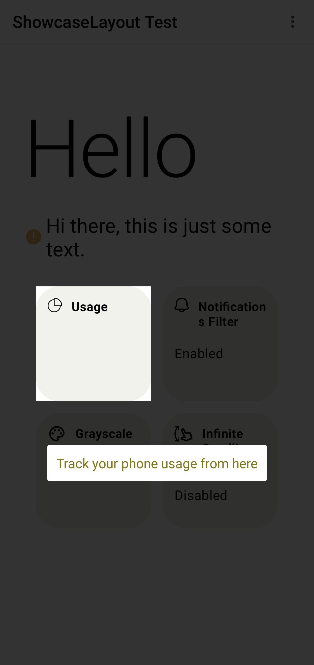
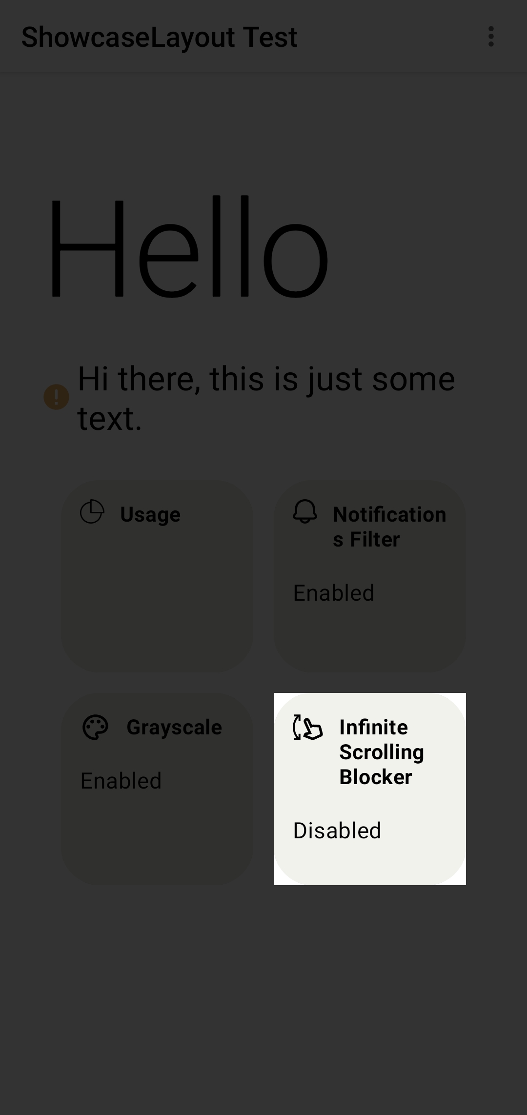
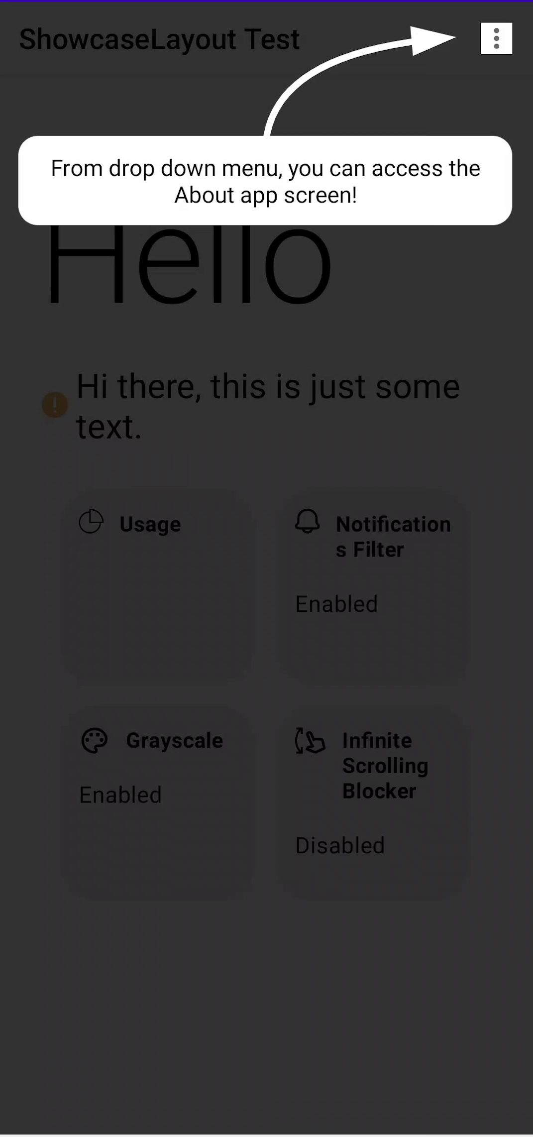
ShowcaseMsg
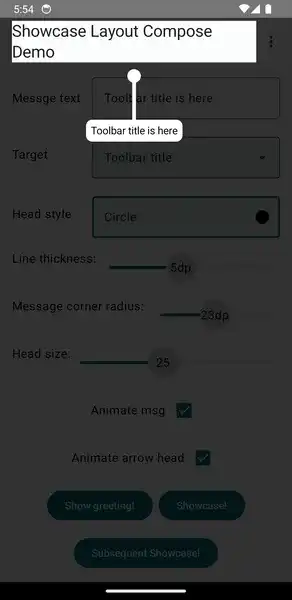
Use ShowcaseMsg() to add a message and customize it with arrow, background and more.
ShowcaseMsg(
    // the message text to be displayed
    "Track your phone usage from here",
    // text style for the message text
    textStyle = TextStyle(color = Color(0xFF827717)),
    // a background color for the text
    msgBackground = MaterialTheme.colors.primary,
    // control corner radius of msgBackground
    roundedCorner = 15.dp,
    // determine if the message will be displayed above or below the target composable
    gravity = Gravity.Bottom,
    // adds an arrow to be displayed with the message
    arrow = Arrow(color = MaterialTheme.colors.primary),
    // starting from version 1.0.3 ShowcaseMsg will have an enter and exit animation of FadeInOut by default you can disable it by using MsgAnimation.None
    enterAnim = MsgAnimation.FadeInOut(),
    exitAnim = MsgAnimation.FadeInOut()
)
| ShowcaseMsg | without ShowcaseMsg |
|---|---|
 |
 |
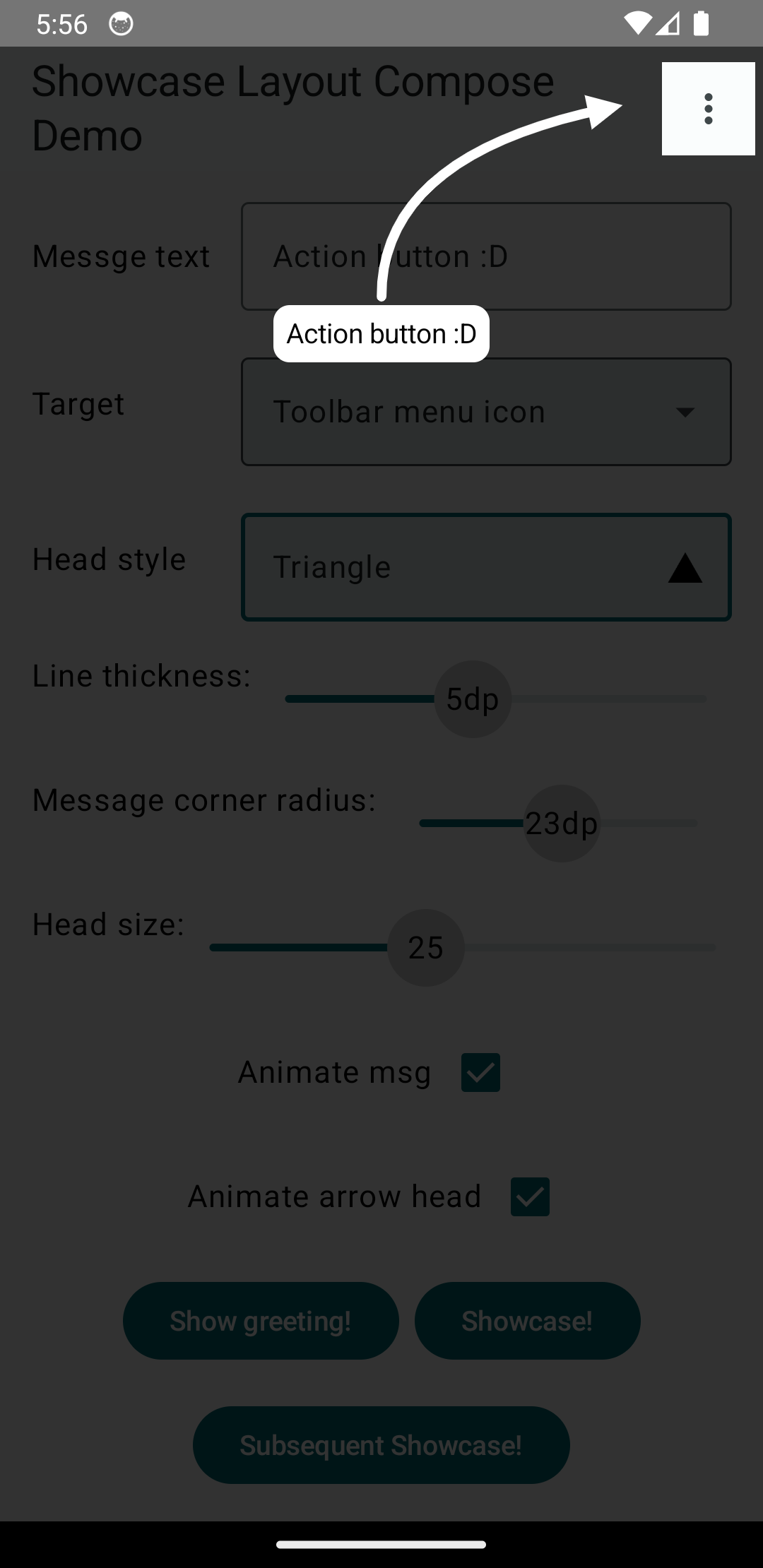
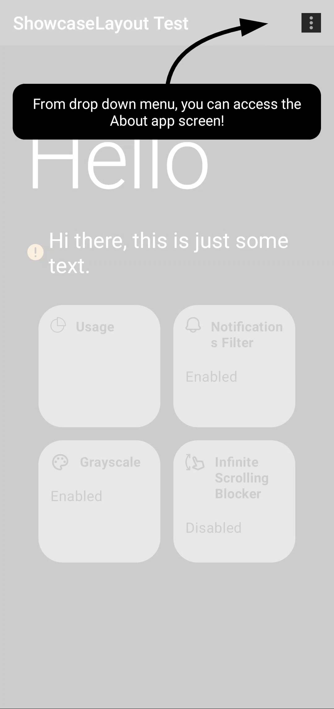
Arrow
Used with ShowcaseMsg to add an arrow pointing to the target
arrow = Arrow(
    // From where the arrow will point at the target, can be: Top, Bottom, Right or Left
    targetFrom = Side.Top,
    // animates a curved arrow from the message to the target(if true targetFrom is ignored)
    // might not work properly depending on the location of the target on the screen
    curved = true,
    // if false then just draw a line (an arrow without head :P)
    hasHead = false,
    // color of the arrow
    color = MaterialTheme.colors.primary
)
| Default Arrow | curved = true |
hasHead = false |
|---|---|---|
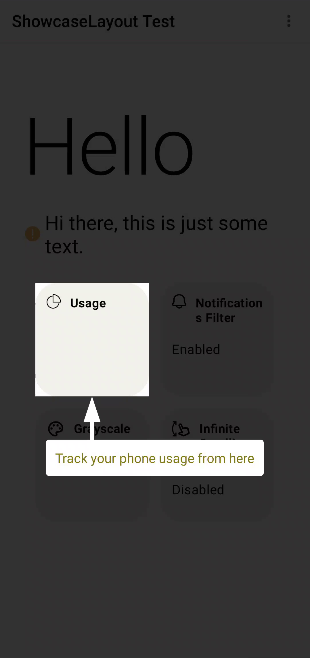 |
 |
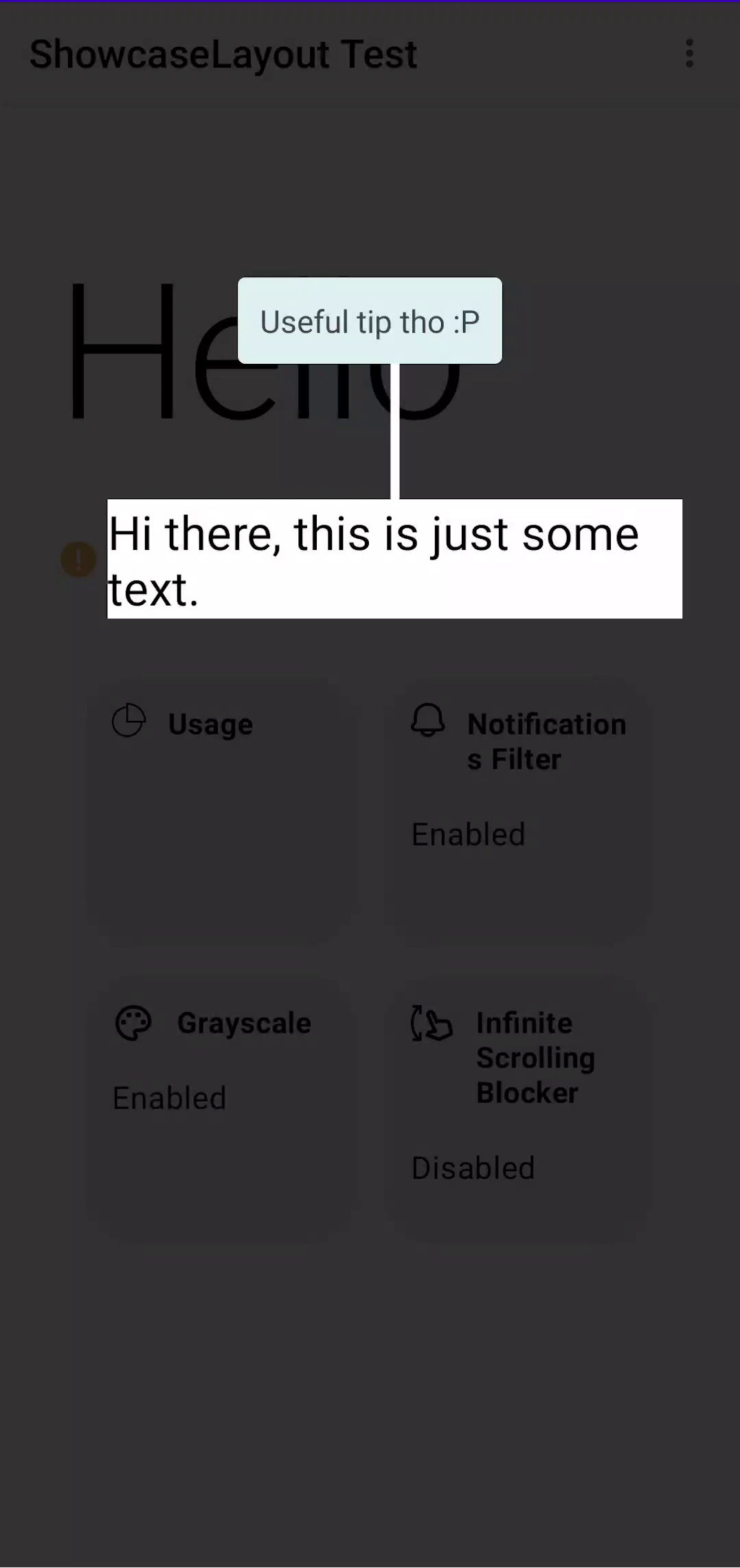 |
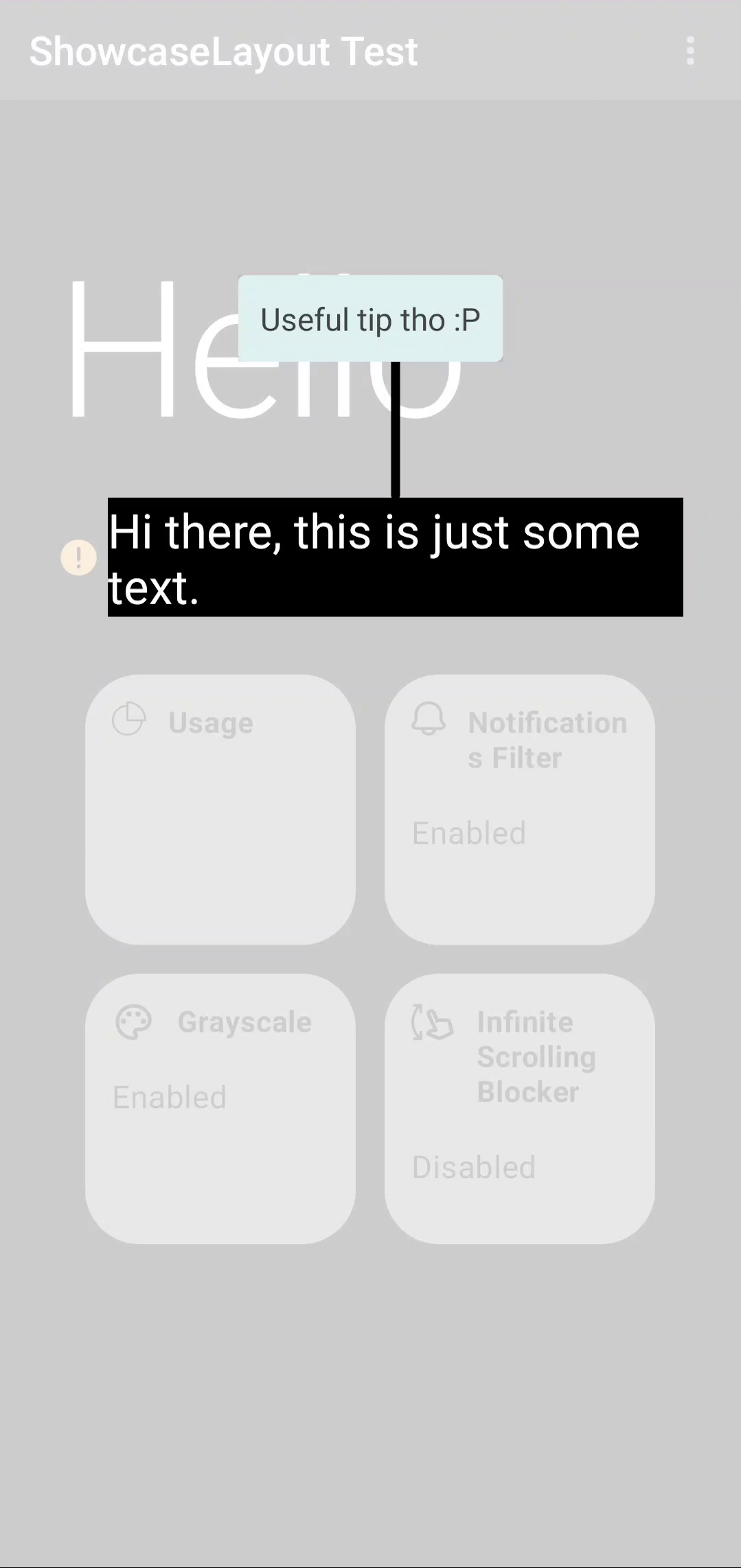
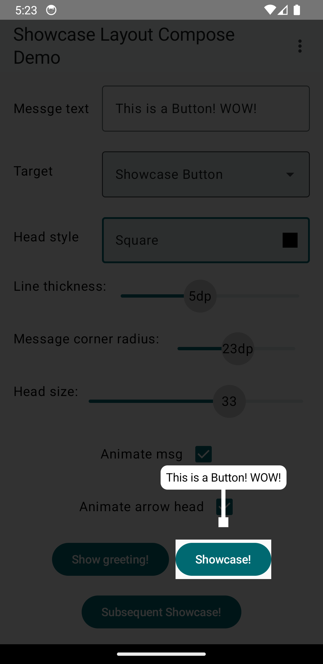
Head style
By default, an Arrow will have a triangle as the head to change this, set head in the arrow to one of these options
TRIANGLE |
CIRCLE |
SQUARE |
ROUND_SQUARE |
|---|---|---|---|
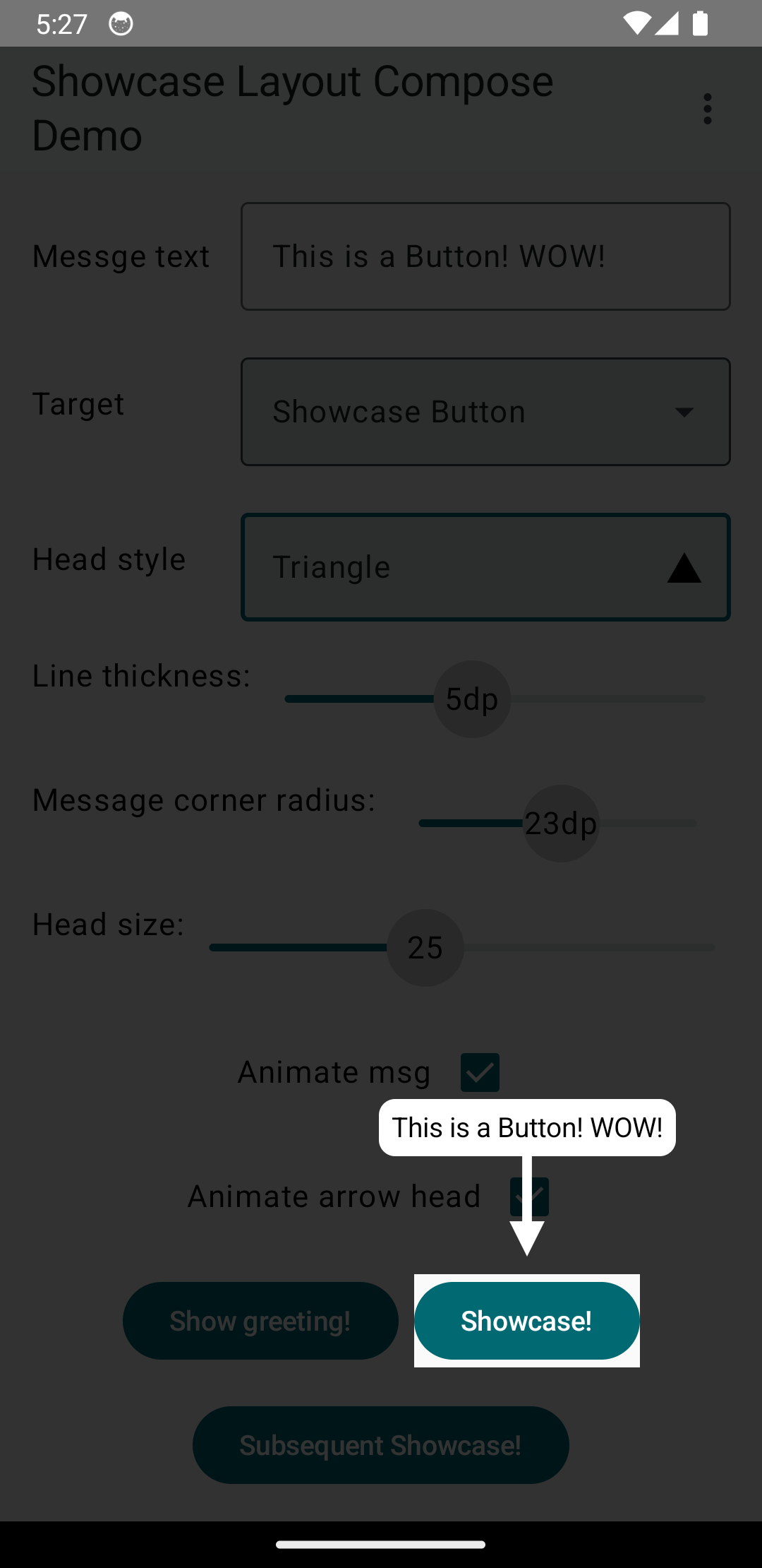 |
 |
 |
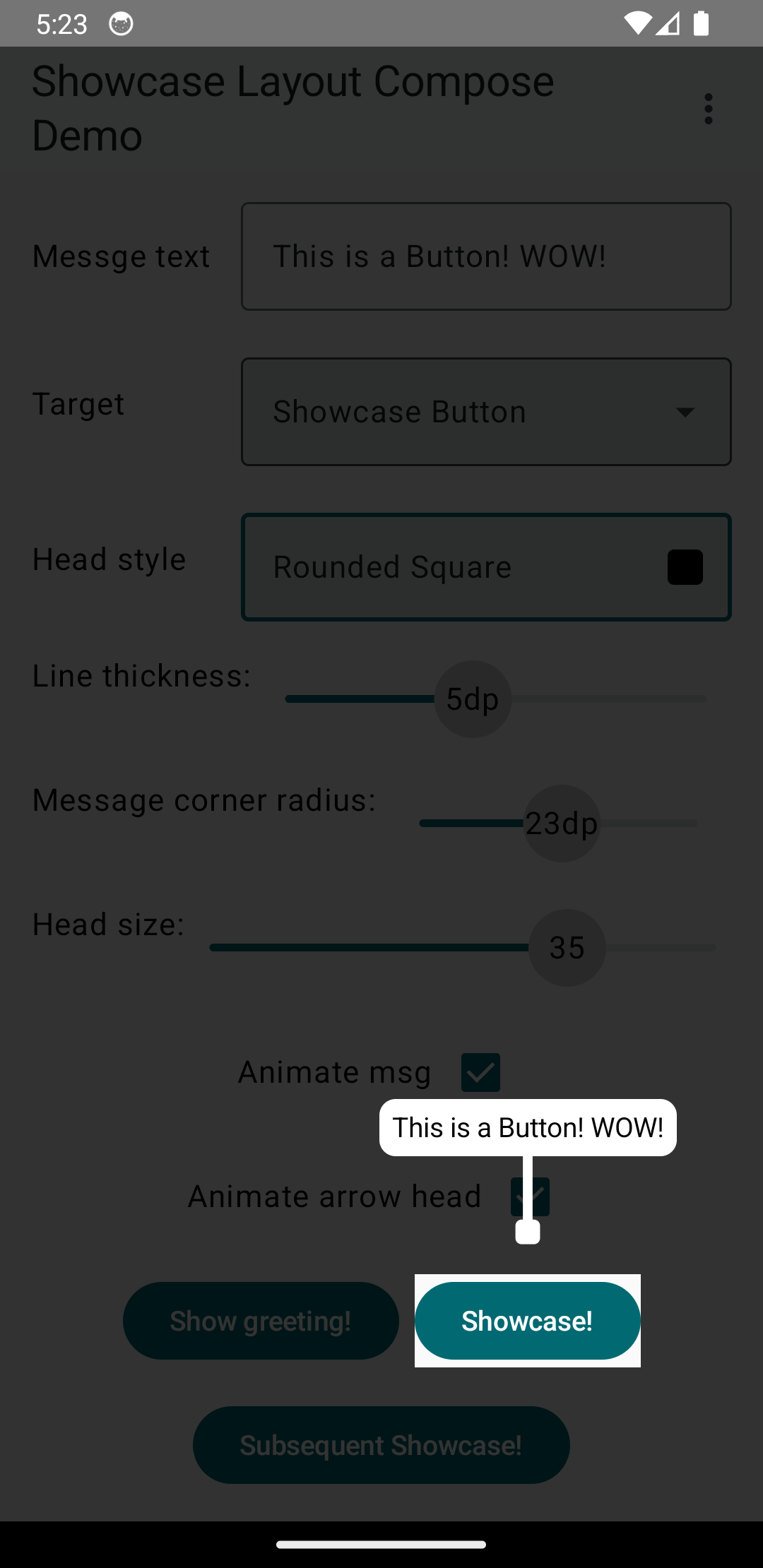 |
You can also animate the arrow head and change the size, see the example below.
showcase(
    index = 5,
    message = ShowcaseMsg(
        "A Circle !",
        textStyle = TextStyle(
            color = Color(0xFF827717),
            fontSize = 18.sp
        ),
        msgBackground = MaterialTheme.colors.primary,
        gravity = Gravity.Top,
        arrow = Arrow(
            color = MaterialTheme.colors.primary,
            targetFrom = Side.Top,
            head = Head.CIRCLE, // head style
            headSize = 30f, // the size of the circle
            animSize = true // animates the arrow head size
        )
    )
)
Logging Events
In recent releases logs have been disabled by default, to print log statement of the current actions taken by compose layout register a listener in your ShowcaseLayout
        registerEventListener(object: ShowcaseEventListener {
            override fun onEvent(level: Level, event: String) {
                println("$level: $event")
            }
        })
Complete Examples
ShowcaseLayout Example
For a complete example of the original ShowcaseLayout, check out MainScreen.kt.
TargetShowcaseLayout Example
For an example of the new TargetShowcaseLayout, check out the App.kt file in the composeApp module.
You can also clone/download this repository and run the demo app to see both layouts in action.
Contributing
Contributions are always welcome!
Used By
Showcase Layout is used by:
Contact me on LinkedIn or open an issue if you used ShowcaseLayout in your app, and you want it added to this list
Related Questions
Similar Libraries
Fragula
🧛 Fragula is a swipe-to-dismiss extension for navigation component library for Android
Intro Showcase View
Highlight different features of the app using Jetpack Compose
Showkase
🔦 Showkase is an annotation-processor based Android library that helps you organize, discover and search Jetpack Compose UI elements
Accompanist
A collection of extension libraries for Jetpack Compose
Browse by Category


