OhTeePee
A Simple, Customizable, Easy-to-use OTP/Pin Jetpack Compose Library for verification code input.
View on GitHubDocumentation


OhTeePee

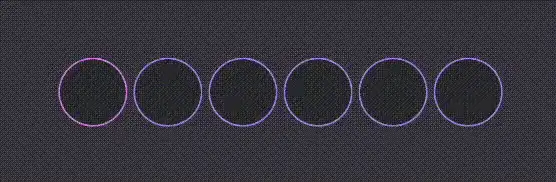
Demo


Implementation
Add the Jitpack repository to your root build.gradle file. If you’re using the settings.gradle file, include it there.
repositories {
    ...
    maven { url 'https://jitpack.io' }
}
Then add OhTeePee dependency to your module build.gradle file.
implementation "com.github.composeuisuite:ohteepee:$versionName"
Usage
First of all, create a basic composable then start to build on it.
@Composable
fun OtpInput() {
    // a mutable state to handle OTP value changes…
    var otpValue: String by remember { mutableStateOf("") }

    // this config will be used for each cell
    val defaultCellConfig = OhTeePeeDefaults.cellConfiguration(
        borderColor = Color.LightGray,
        borderWidth = 1.dp,
        shape = RoundedCornerShape(16.dp),
        textStyle = TextStyle(
            color = Color.Black
        )
    )

    OhTeePeeInput(
        value = otpValue,
        onValueChange = { newValue, isValid ->
            otpValue = newValue
        },
        configurations = OhTeePeeDefaults.inputConfiguration(
            cellsCount = 6,
            emptyCellConfig = defaultCellConfig,
            cellModifier = Modifier.size(48.dp),
        ),
    )
}
To customize it further, you can use config parameters such as filledCellConfig, activeCellConfig, errorCellConfig and errorAnimationConfig to create different UI behaviour for different situations.
@Composable
fun OtpInput() {
    ...

    OhTeePeeInput(
        ...
        configurations = OhTeePeeDefaults.inputConfiguration(
            ...,
            emptyCellConfig = defaultCellConfig,
            filledCellConfig = defaultCellConfig,
            activeCellConfig = defaultCellConfig.copy(
                borderColor = Color.Blue,
                borderWidth = 2.dp
            ),
            errorCellConfig = defaultCellConfig.copy(
                borderColor = Color.Red,
                borderWidth = 2.dp
            ),
            errorAnimationConfig = null, // default is OhTeePeeErrorAnimationConfig.Shake(),
            placeHolder = "-",
        ),
    )
}
Optionally, you can insert a divider between cells like a padding or a dash.
@Composable
fun OtpInput() {
    OhTeePeeInput(
        ...
        divider = { index ->
            Row {
                Spacer(modifier = Modifier.width(4.dp))
                if (index == 1) {
                    Text(" - ", color = Color.White)
                }
                Spacer(modifier = Modifier.width(4.dp))
            }
        }
    )
}
This is just the tip of the iceberg when it comes to customization of OhTeePee libray. If you want to see more, definitely check out this article.
Todo List
- Read OTP Code directly from SMS
- Add animations
Authors
Ilyas Ipek
- Medium: @ilyasipek
- Github: @ilyasipek
- LinkedIn: @ilyas-ipek
Tarik Yasar
- Medium: @tyasar
- Github: @tarikyasar
- LinkedIn: @tarik-yasar
Contributing
We are always open to new ideas! To contribute, please check following steps:
- Open an issue first to discuss what you would like to change.
- Fork the Project
- Create your feature branch (
git checkout -b feature/new_feature) - Format code using Ktlint (
./gradlew ktlintFormat) - Commit your changes (
git commit -m 'Add some new feature') - Push to the branch (
git push origin feature/new_feature) - Open a pull request
Show your support
⭐️ Give us a star if this project helped you! ⭐️
LICENSE
Similar Libraries
Heart Switch
❤️ A heart-shaped toggle switch component for Jetpack Compose
Kompose Country Code Picker
A Jetpack Compose library based on Material 3 that provides a country code picker for Android apps.
OneTapCompose
Easily integrate One-Tap Sign in with Google (Credential Manager) in your project with Jetpack Compose. No boilerplate code.
Compose RatingBar
A customizable rating bar component for Jetpack Compose with support for half ratings and custom shapes.
Browse by Category


